The animated vine font turned out well.
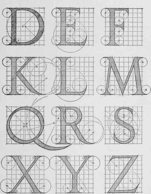
Upper case alphabets from the Roman Columns
Geofroy Tory
Albrecht Durer
http://chestofbooks.com/architecture/Cyclopedia-Carpentry-Building-4-6/Letter-Forms.html#.UxsSjPmSw2I
Still looking for a good lower case font.
The upper case was based on the roman columns, and there were no lower case letters for quite a while, but I have seen several that look OK next to them, just no diagrams for construction.
A lot of fonts are Bézier Curves, but they don't have the same visibly decipherable construction
Looking for the mechanics of Liz Collini's designs
The slant makes the Italics difficult + no circles or compass instructions for the curves
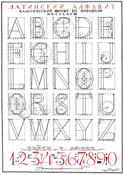
Great source for caps
Iakov Chernikhov, Ukrainian architect/artist
Blending scenes into text
http://www.linesandcolors.com/images/2014-02/jones_450.jpg
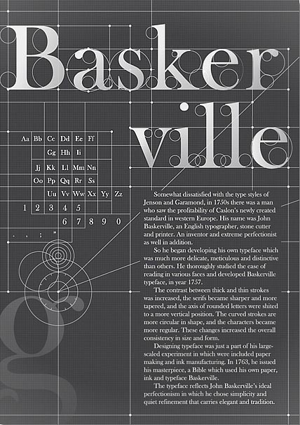
http://weandthecolor.com/wp-content/uploads/2012/06/Baskerville-Typography-Poster-01.jpg
???
Charles Louis Simonneau, engraver (22 May 1654, Orléans – 1727, Paris)
ROMAIN DU ROI (ROMAN) Designed by the French Academy of Science Graphic Novelty: Horizontal Serif.
https://s-media-cache-ak0.pinimg.com/736x/4e/1a/d3/4e1ad30c72590536bb53ab6cb795d7a9.jpg
Charles Louis Simonneau's lower case alphabet is the best I have found so far, but I am not nuts about the V, X, or J, and there is no W


No comments:
Post a Comment