Sunday, June 26, 2016
Comfest
I spent the weekend shooting Comfest. The P2 camera only holds about 30minutes of footage, and the Compression with the Canon Rebel is absolute garbage, so I didn't get as much footage as I hoped, but it is a start, and I still have the Doo-Dah parade on the 4th, and I am trying to volunteer for the Hemp-Fest on campus this fall.
Tuesday, June 21, 2016
The Paint Effects are Not Reacting to Lights
The file with the "Once" paint effects which I converted into polygons to render with Mental Ray is no longer linking the lights with the paint effects. I am getting an error about a Global shader, and another one about the maximum polygon limit. I think rendering more than a couple letters is just more than the software can handle, so I am exporting the curves, and I am going to to try to recreate the paint effects in another file. I am a little more comfortable with the nodes, and I think I can streamline the process so I do not have to adjust the parameters for each stroke individually (there were about 6 - 12 strokes per letter and each took a lot of tweaking to be readable and animate properly.
 The inputs have not behaved as I hoped. Duplicating the stroke, even with input connections seems to have caused an error with the animated growth. and neither of the vines grow after duplication.
Update:
It looks like it was just a glitch with the viewing window because the vines are animated when I render the frames.
Update again:
I am still having a lot of glitches. I exported the curves alone, and I still cannot get the preview window to display things properly.


Update:
It looks like it was just a glitch with the viewing window because the vines are animated when I render the frames.
Update again:
I am still having a lot of glitches. I exported the curves alone, and I still cannot get the preview window to display things properly.

Monday, June 20, 2016
Paint Effects and Pollygons
I created another word "upon" but there is a problem with the rendering. It seems converting the files to polygons has done something to the textures, and are they no longer associated with the paint effects. It is impossible to judge weather the letters are readable or match without having them together when I cannot see the letters with the texture. I am having trouble finding the file as it was before I converted the paint effects to polygons.
Friday, June 10, 2016
In Mental Ray
Maya Software (12 sec a frame)
Mental Ray (3-4 minutes a frame)
I got the animation to run in Mental Ray. Mental ray wouldn't render the paint effects so I had to convert it to polygons. I added image based lighting from a high dynamic range image too. It looks much more realistic, but I am not sure if it is really better or easier to read.
Thursday, June 9, 2016
Wednesday, June 8, 2016
Lower case letter
Tuesday, June 7, 2016
More Animated Fonts
The animated vine font turned out well.
Upper case alphabets from the Roman Columns
Geofroy Tory

Albrecht Durer


Still looking for a good lower case font.
The upper case was based on the roman columns, and there were no lower case letters for quite a while, but I have seen several that look OK next to them, just no diagrams for construction.

A lot of fonts are Bézier Curves, but they don't have the same visibly decipherable construction
Looking for the mechanics of Liz Collini's designs


The slant makes the Italics difficult + no circles or compass instructions for the curves
Great source for caps
Iakov Chernikhov, Ukrainian architect/artist
Blending scenes into text
http://www.linesandcolors.com/images/2014-02/jones_450.jpg
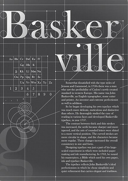
http://weandthecolor.com/wp-content/uploads/2012/06/Baskerville-Typography-Poster-01.jpg
???

Charles Louis Simonneau, engraver (22 May 1654, Orléans – 1727, Paris)


ROMAIN DU ROI (ROMAN) Designed by the French Academy of Science Graphic Novelty: Horizontal Serif.
https://s-media-cache-ak0.pinimg.com/736x/4e/1a/d3/4e1ad30c72590536bb53ab6cb795d7a9.jpg
Charles Louis Simonneau's lower case alphabet is the best I have found so far, but I am not nuts about the V, X, or J, and there is no W


Sunday, June 5, 2016
Performative Function of the Animated Typography
Locution:
Text describing the goose finding the tube
Illocution:
The goose found something shiny, something he likes, something he naively wants to be
Perlocution:
The audience is decyphering the words through the delay of the animated typographic construction, an experience parallel with the character's serendipitous discovery. At this point the audience and the goose should both feel a parallel familiar attraction, but the foreshadowing implied through "there was no one who said that he couldn't" suggests the naivety.
Primitive:
Disorientation, Context
Page 3 in Context (rough)
Once upon a time there was probably a goose

There were probably lots of geese
and this goose was no exception

but he didn't know that
Because he was just a goose...

Animated Typography "A"
I used the frames from the gif to make a template in Premiere. It is vector based now, so I can change the width of the lines to make them visible at smaller sizes. All the animation is done through wipes, so I can replace the lines and circles with photographs or scans of hand made lines and circles to give it a tangible, paper aesthetic.
The letter A
An example in context

The letter A
would bee seen opposite the animated version of this slide:

Typography Animation
I took the instructions from one of the pages and made an animated gif to test for the book.


The one in the book would be hand drawn, and the lines would draw in, not fade, with no color or lables, just the guidelines.
Something like this would be used for the "A" in: A Human thing was around
Fonts
I found this looking for fonts that I could create an animated the construction withChamp Fleury.
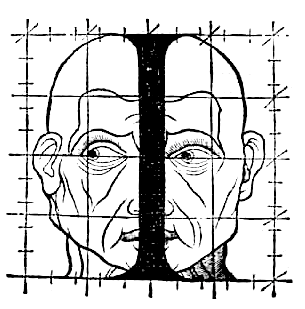
Champ Fleury in 1529 by Geofroy Tory
http://luc.devroye.org/fonts-32678.html
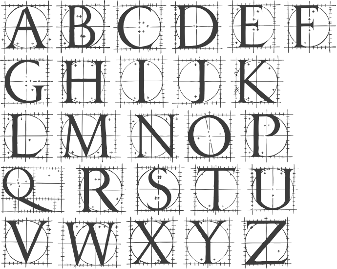
Fully illustrated handbook where the author explains how to draw Roman characters, and compares the letters to the human body.
Not pretty, but it easily explains how to create capital characters with a compass and a ruler, and the human forms might be useful in the scene when the goose enters the human world.

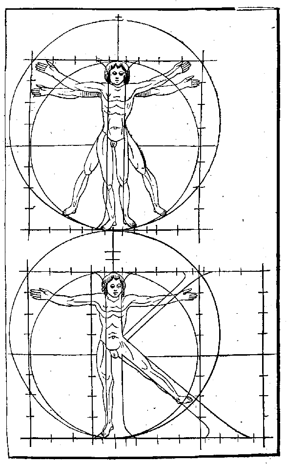


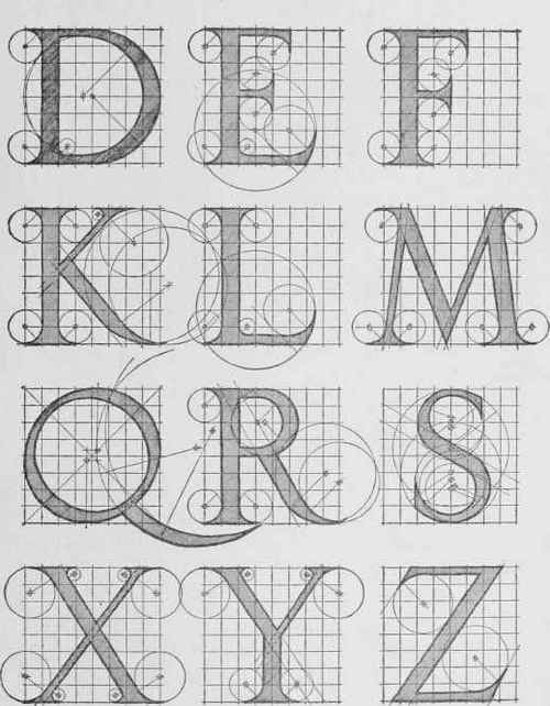
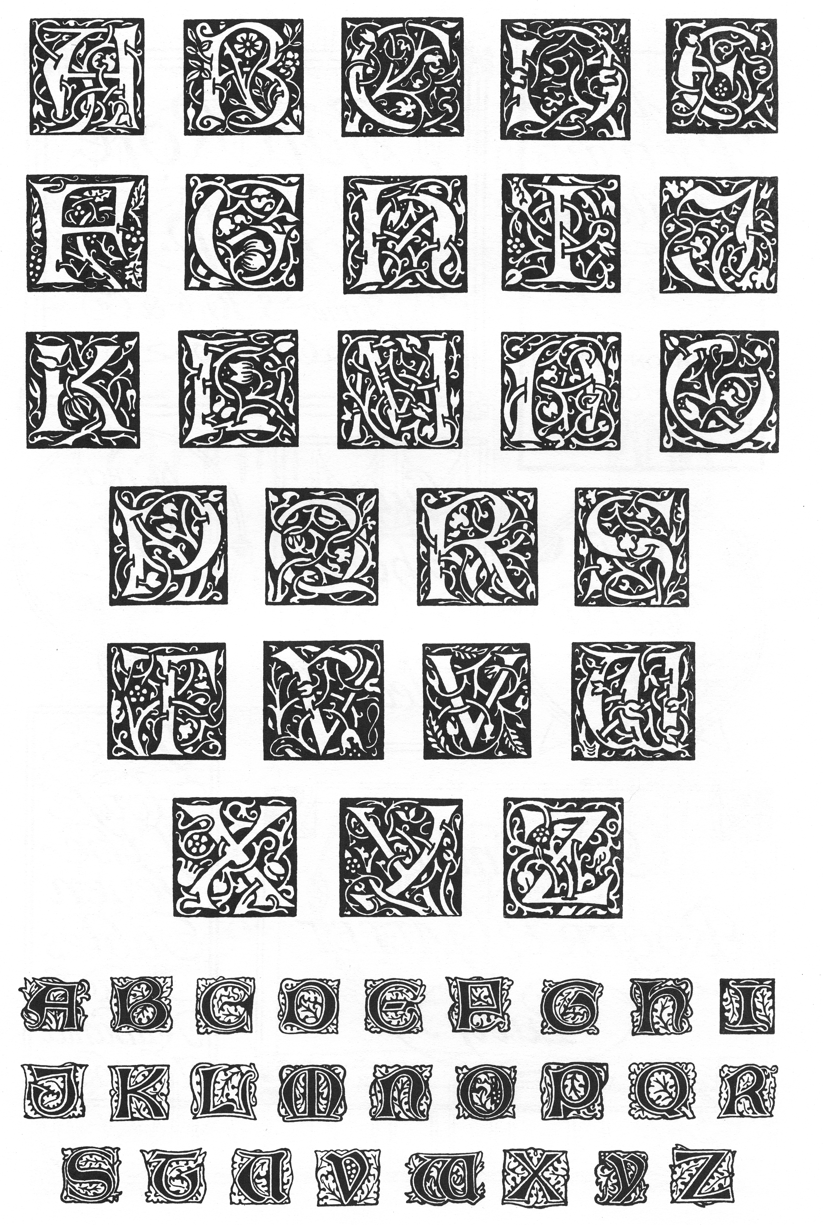
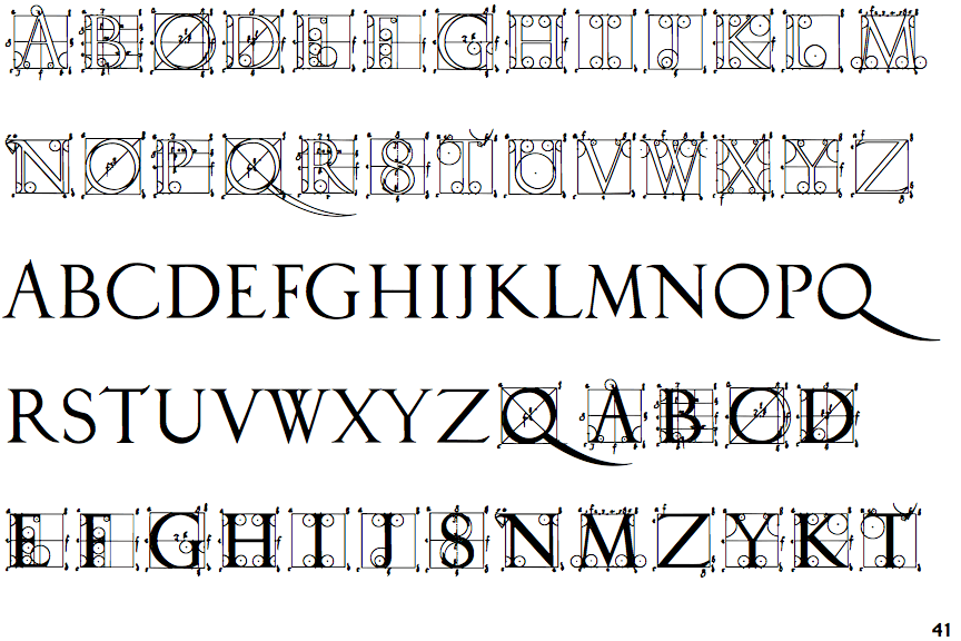
Alphabet of Classic Renaissance Letters according to Albrecht Durer

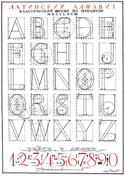
A Constructed Roman Alphabet: A Geometric Analysis of the Roman Alphabet Including the Greek Characters and the Arabic Numerals by David Lance Goines
Maybe a William Morris font for the goose world
http://luc.devroye.org/fonts-24795.html

Champ Fleury in 1529 by Geofroy Tory
http://luc.devroye.org/fonts-32678.html
Fully illustrated handbook where the author explains how to draw Roman characters, and compares the letters to the human body.
Not pretty, but it easily explains how to create capital characters with a compass and a ruler, and the human forms might be useful in the scene when the goose enters the human world.
Some of these are down right ugly, but might be useful in limited use as dramatic punctuation.
A human thing was around
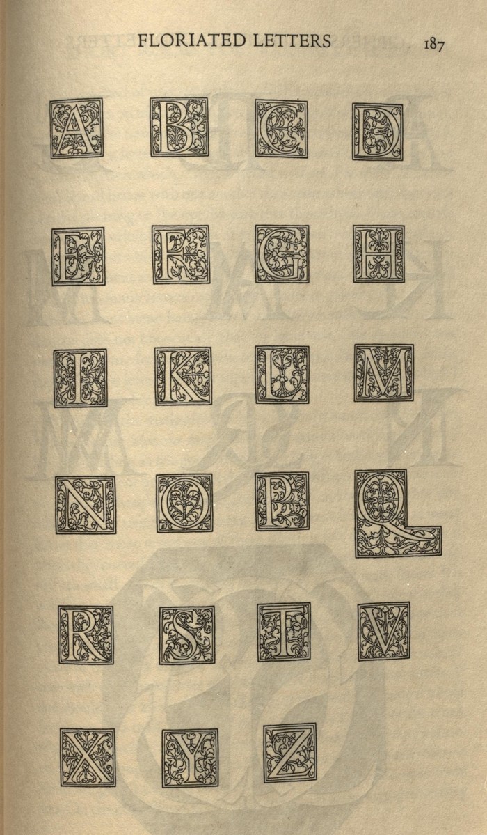
Floriated Letters
Tory, Geoffroy, George B. Ives, and Bruce Rogers. Champ Fleury. New York: Grolier Club, 1927. Print.
Alphabet of Classic Renaissance Letters according to Albrecht Durer
http://www.professores.uff.br/hjbortol/arquivo/2011.1/goines/goines-html/goines-a-en-html5.html
A Constructed Roman Alphabet: A Geometric Analysis of the Roman Alphabet Including the Greek Characters and the Arabic Numerals by David Lance Goines
Maybe a William Morris font for the goose world
http://luc.devroye.org/fonts-24795.html
Once upon a time there was probably a goose
Saturday, June 4, 2016
Intro
(drawn in; animated)
Text:
Once upon a time there was probably a goose

***
Page Turn (other geese also drawn in)
Text:
There were probably lots of geese
and this goose was no exception

***
Page Turn
Text:
but he didn't know that
because he was just a goose

***
Page Turn
Text:
A human thing was around
And that's what he thought he would be
Because there was no one who said
he couldn't

The letters will also be animated and drawn in with the typographic construction lines first, followed by the fill
Subscribe to:
Posts (Atom)