Champ Fleury in 1529 by Geofroy Tory
http://luc.devroye.org/fonts-32678.html
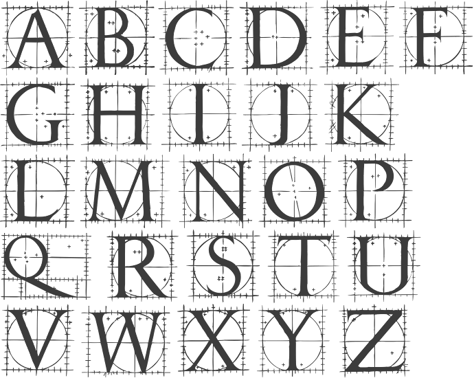
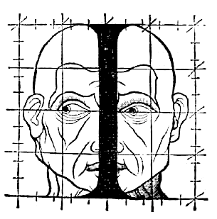
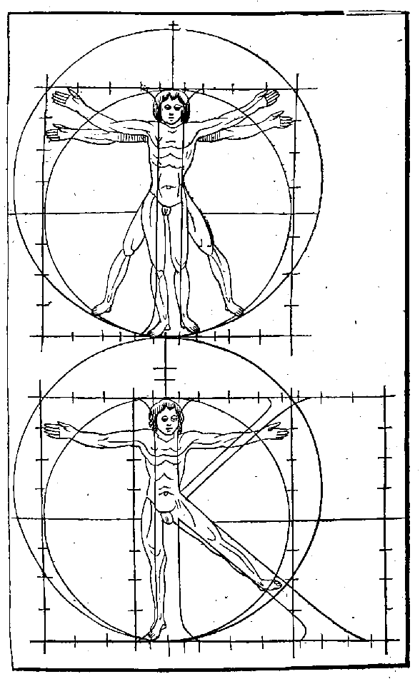
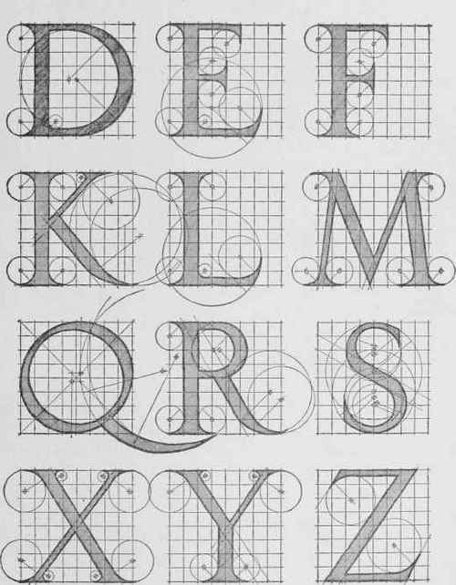
Fully illustrated handbook where the author explains how to draw Roman characters, and compares the letters to the human body.
Not pretty, but it easily explains how to create capital characters with a compass and a ruler, and the human forms might be useful in the scene when the goose enters the human world.
Some of these are down right ugly, but might be useful in limited use as dramatic punctuation.
A human thing was around
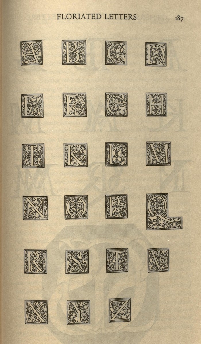
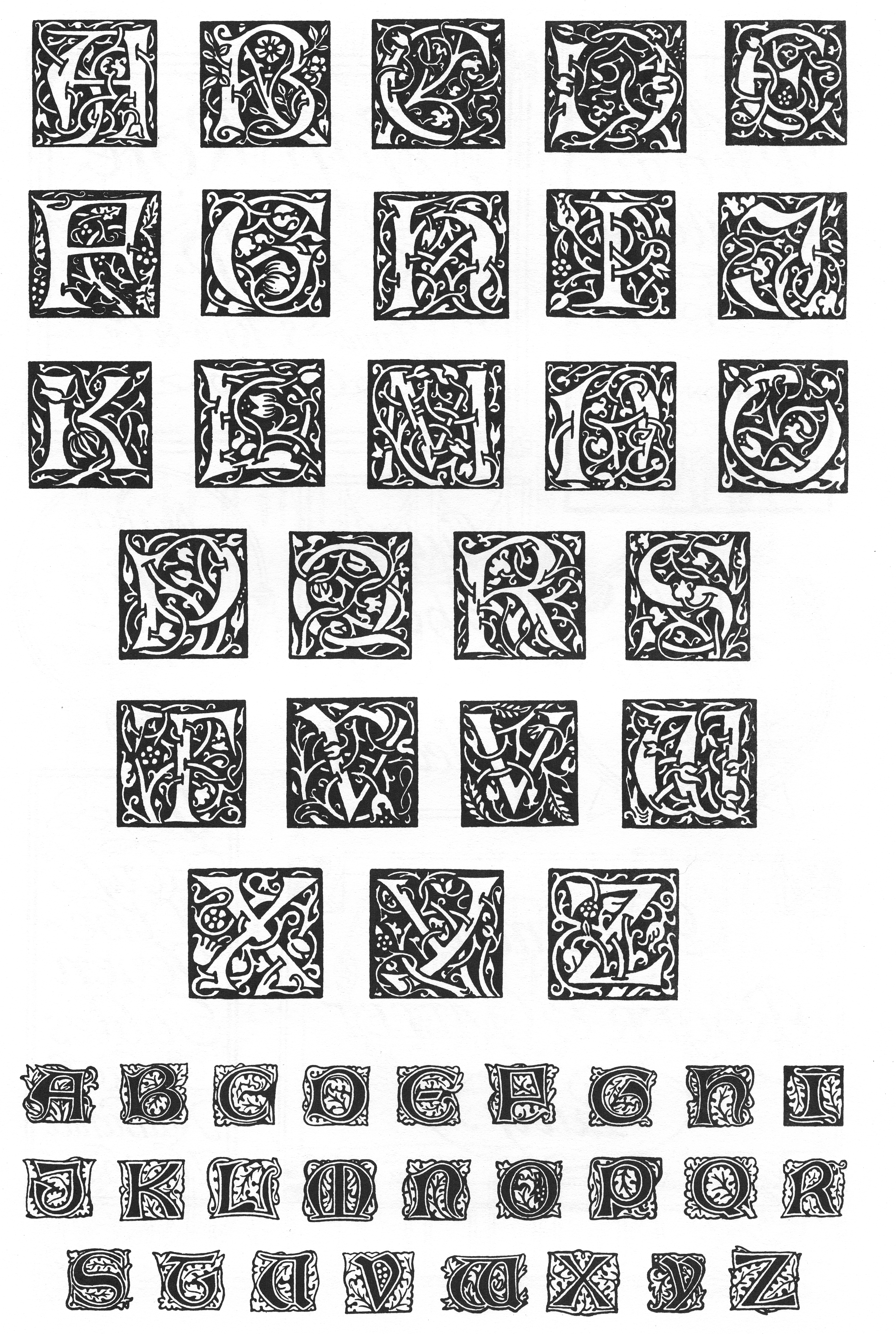
Floriated Letters
Tory, Geoffroy, George B. Ives, and Bruce Rogers. Champ Fleury. New York: Grolier Club, 1927. Print.
http://www.professores.uff.br/hjbortol/arquivo/2011.1/goines/goines-html/goines-a-en-html5.html
A Constructed Roman Alphabet: A Geometric Analysis of the Roman Alphabet Including the Greek Characters and the Arabic Numerals by David Lance Goines
Maybe a William Morris font for the goose world
http://luc.devroye.org/fonts-24795.html
Once upon a time there was probably a goose





No comments:
Post a Comment