Showing posts with label construction considerations. Show all posts

Monday, April 17, 2017

Bay Reaction shot with a telephoto lens

https://en.wikipedia.org/wiki/Angle_of_view#Focal_length

I don't think Michael bay is using a telephoto lens in most of these shots.

 35mm equivalent

fl 85diagonal angle 28.6Vertical 16.1Horizontal 23.9
 https://en.wikipedia.org/wiki/Angle_of_view#cite_note-17


The background is very blurry. If the focal length is 85, the angle of view is approximately 16 X 24 degrees. 

The subject would have to be about 86 feet away (arc tan of 16 degrees) to get 3 feet vertical (it would wind up smaller with the crop factor https://en.wikipedia.org/wiki/Crop_factor). 

With an f/1.4 the background would have to be more than 1000 feet away... 
http://www.photopills.com/calculators/dof


a few Bay shots
https://youtu.be/2THVvshvq0Q?t=1m41s

Tuesday, March 28, 2017

Getting unstuck

I don't really understand why I am detailing my meanderings with my theory, so the direction has been a bit chaotic. In an attempt to put words to paper, I am starting with a performative breakdown of the elements and trying to transform it into a detail of how the theory worked in practice.
The Form through the Formula
The technical, visual aesthetic, and formal linguistic (semantic/lexical/phonemic) decisions were informed by the performative function of each element and a counterpoint between the circular form of the goose's (heroe's) journey, interactive paradigm, suggestion of indexicality, character arc, and the indexical allusions of the aesthetic.
The interface changes from a book to an interactive animation at a moment in the story when the protagonist is out of his element. This is done in order to generate a disorientation for the audience and identification with the protagonist through a common experience. In order to be effective, the audience has to expect the interface to behave like a book. For this reason, several of the aesthetic decisions in the beginning of the story and the end are made in an attempt to evoke the presence of a book (my ideas of evoking presence are based on the “aura” described by Walter Benjamin in “The Work of Art in the Age of Mechanical Reproduction”, but I do not think the actual artifact needs to be there to generate a similar sensation).
Examples of illusory imagery to imply indexicality are in the “book opening” animation, the “vine text” animation, and the sound of a page turning that accompanies the transitions between the scenes when the goose is in the human world. The performative function of the opening imagery, interaction, and animations associated with the experience of reading a book (i.e. paper texture, shading, and sound of paper) is to mislead the audience to anticipate the experience to be similar to reading a story from a book and the dramatic effect when the expectation is broken.


Locution
imagery, interaction, and animations associated with the experience of reading a book (i.e. foliage, shadow, imagery/sound of paper)
Illocution
suggest that the audience is holding a book
Perlocution
suspension of the awareness of the digital medium

Primitive
sound, interaction, and imagery with shading and dimensionality consistent with an object in the viewer’s space
Constative
this is an animation of a book
Explicit Performative Function
mislead the audience (i. e. build an expectation that the experience will be like a book in order to break the expectation for dramatic effect)


Cited:
Benjamin, Walter. “The Work of Art in the Age of Mechanical Reproduction.” Film Theory and Criticism: Introductory Readings, edited by Braudy, Leo and Cohen, Marshall, New York: Oxford University Press, 2009. Print.


Thursday, January 26, 2017

Rerendering some stuff

I have had to redesign and rerender some stuff (the foliage text needs to be large to be worth the render time, so I am limiting it to the Drop Cap.
I have used so many different versions I am having trouble figuring out which one was the final and getting the lighting to match. THis is the Book Opening, which I am trying to match with the lighting for the first page (there is a paratext page that says "Tuba-Goose Chapter | One: Probably a Goose"), but I do not have the animation for the Paratext page yet.


Tuesday, November 29, 2016

Collage Approach


The text in this scene was made by cutting and pasting pieces from other texts to stitch together a narrative.

Tuesday, August 9, 2016

Rough Draft of the Animations for Pages 1 to 4

Page 1
Ivy text growing on the opposite page reads:
Once upon a time 
there was probably a goose

The user would turn the page with a swiping motion  to advance from the last frame to the next page.
***
Page 2

Ivy text growing on the opposite page reads:

There were probably lots of geese, 
and this goose was no exception

The user would turn the page with a swiping motion  to advance from the last frame to the next page.
***
Page 3
(this page will be hand drawn, the Photoshop image is just a prototype).

Ivy text growing on the opposite page reads:
But he didn't know that
because he was just a goose

The user would turn the page with a swiping motion  to advance from the last frame to the next page.
***
Page 4

Animated hand drawn typography (with a compass) on the opposite page reads:
A human thing was around
and that is what he thought he would be

The user would turn the page with a swiping motion  to advance from the last frame to the next page.


Saturday, July 9, 2016

Rare Books and Light Probes

I found my camera, and I used it to shoot light probes from the areas I shot in cloudy weather (I already had one for the sunny days in Goodale Park around 2-3 pm, but I misplaced my camera before the Doo-Dah parade, which was cloudy, and in a very different area.).

I couldn't use a flash, and a Librarian had to hold some of the more interesting books, because they didn't have a pillow for the bigger ones, but I got a lot of images of a variety of book covers, paper, font, and embellishments.


Several of these were hundreds of years old, and you would not expect them to be pop up, but they fit the fairy tale aesthetic. I might start with the older cover, and gradually fade into the newer stuff as I begin to incorporate color images and animation.


Tuesday, June 7, 2016

More Animated Fonts


The animated vine font turned out well.


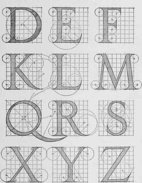
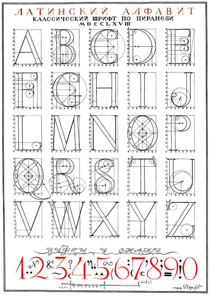
Upper case alphabets from the Roman Columns
Geofroy Tory

Albrecht Durer

http://chestofbooks.com/architecture/Cyclopedia-Carpentry-Building-4-6/Letter-Forms.html#.UxsSjPmSw2I


Still looking for a good lower case font.


The upper case was based on the roman columns, and there were no lower case letters for quite a while, but I have seen several that look OK next to them, just no diagrams for construction.

 A lot of fonts are Bézier Curves, but they don't have the same visibly decipherable construction

Looking for the mechanics of Liz Collini's designs


http://www.typography.com/images/historyImages/didot/rdr_italic_lc_construction_750.png
The slant makes the Italics difficult + no circles or compass instructions for the curves


Great source for caps

Iakov Chernikhov, Ukrainian architect/artist 

Blending scenes into text
http://www.linesandcolors.com/images/2014-02/jones_450.jpg

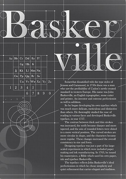
http://weandthecolor.com/wp-content/uploads/2012/06/Baskerville-Typography-Poster-01.jpg


???


Charles Louis Simonneau, engraver (22 May 1654, Orléans – 1727, Paris)


ROMAIN DU ROI (ROMAN) Designed by the French Academy of Science Graphic Novelty: Horizontal Serif.

https://s-media-cache-ak0.pinimg.com/736x/4e/1a/d3/4e1ad30c72590536bb53ab6cb795d7a9.jpg
Charles Louis Simonneau's lower case alphabet is the best I have found so far, but I am not nuts about the V, X, or J, and there is no W


Sunday, June 5, 2016

Animated Typography "A"

I used the frames from the gif to make a template in Premiere. It is vector based now, so I can change the width of the lines to make them visible at smaller sizes. All the animation is done through wipes, so I can replace the lines and circles with photographs or scans of hand made lines and circles to give it a tangible, paper aesthetic.
The letter A
An example in context
would bee seen opposite the animated version of this slide:

Friday, October 16, 2015

The Return Walk

If the character is walking left (returning from a right facing action), the text following the character would have to go in the other direction. This action reversal is unlike a book, so I am looking into ways to compensate, without crossing the line of action.
This shot works, the text is in the background on the wall, so the wall needs to be photo realistic.